MSU Majors Event App
UX/Graphic Designer
Role
4 UX/Graphic Designers
Team
Figma, Sketching, Adobe Illustrator, Word
Tools
One Semester
Timeline
Overview
The MSU Event Board App is a human-centered UX project focused on improving how Michigan State University students discover, navigate, and engage with campus events—especially those related to STEM majors. This project originated from a series of interviews with MSU students, alumni, and professors, where my project team investigated campus culture, community challenges, and barriers that prevent students from participating in academic and social opportunities.
Problem
MSU students—particularly in STEM—struggle to:
-
Find events related to their academic department
-
Connect with peers and build community
-
Learn about academic/career opportunities
-
Navigate campus to locate event spaces
-
Engage socially due to a lack of clear, centralized event information
The lack of visibility and organization around events leads to fewer networking opportunities, missed resources, and weaker student engagement.
Solution
We thought of the question: How might we advertise events more effectively and make them more appealing for undergraduate students, so they have more opportunities to meet peers, engage with their community, and discover academic and career-supportive events within their department? This guiding question shaped the entire design approach. To solve issues of low event awareness and limited student connection, we created a centralized and intuitive event platform tailored to MSU students. The MSU Event Board App makes it easy to discover events, connect with peers, and access personalized opportunities.
Process/Implementation
Research
Our project began with interviews conducted with MSU students, alumni, and professors. We wanted to understand how students currently learn about events, what barriers prevent them from participating, and how campus culture influences social and academic engagement. Through affinity mapping, we synthesized interview insights into themes:
-
Lack of event visibility and poor advertising
-
Difficulty meeting peers within the same major or department
-
Confusion navigating campus buildings and event locations
-
Missed opportunities for academic growth and networking
-
Desire for more supportive and accessible community spaces

Ideation & Concept Development
Using our research insights, we brainstormed core features that would address students’ needs:
-
A centralized map of events across campus
-
A feed view to browse personalized opportunities
-
Event detail pages with time, location, description, and sharing options
-
Direct messaging to ask organizers questions and connect with peers
-
Favorites and profile management, allowing users to save events or create posts
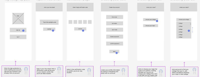
We sketched early user flows and low-fidelity wireframes to visualize how students would move through the app—from onboarding to event discovery to communication.
User Task Flows
We created detailed task flows to test the logic and simplicity of our design:
-
First-time onboarding: account creation using MSU email verification, selecting major/college, and customizing interests
-
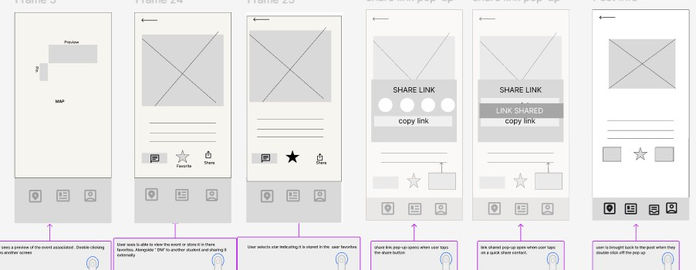
Event discovery: navigating the map filters, exploring posts in the feed, viewing event details
-
Communication flow: messaging organizers or sharing event links
-
Profile flow: checking favorites, making new posts, viewing archived events
These flows ensured that the app remained intuitive, consistent, and supportive of student needs.

Low-Fidelity Wireframes
Next, we translated our task flows into quick sketches. These helped us:
-
Test layout ideas
-
Determine hierarchy of information
-
Explore multiple navigation options
-
Visualize how our map, feed, and messaging screens would connect
Feedback from classmates and instructors helped us refine icon clarity, labeling, and user expectations early on.
Mid-Fidelity Designs
We then developed structured mid-fi wireframes in Figma:
-
Introduced consistent spacing, card layouts, and iconography
-
Tested the tab-bar navigation system
-
Added interaction notes to test the flow
These mid-fi designs helped us ensure usability before adding branding and visual polish.
Style Guide Development
To maintain consistency, we created a style guide that included:
-
Typography: Bebas Neue for titles; Figtree for headers and body text
-
Iconography: Phosphor icon set (regular/flat)
-
Color System: green secondary palette inspired by MSU, grayscale primary palette
-
Buttons: clear distinction between primary and secondary actions
This guide helped unify our design across screens and improve readability.

High-Fidelity Prototype
Finally, we created a full hi-fi prototype that incorporated:
-
Interactive map view with event pins
-
A clean event feed for browsing
-
Direct messaging UI
-
Event detail screens with sharing and saving options
-
A full onboarding sequence
-
A personalized profile page
We conducted informal usability tests with peers, which revealed improvements for icon clarity, simplifying navigation, and strengthening the hierarchy on event detail pages.
What I Learned
Through this project, I learned how to apply human-centered design methods—from interviews and affinity mapping to building user flows and prototypes. I strengthened my skills in structuring intuitive navigation, developing consistent visual systems, and iterating based on user feedback. Working with my team also taught me how to communicate design decisions clearly and collaborate effectively throughout the UX process.
Next Steps
Future improvements include refining event filters, enhancing accessibility, and expanding social features like following users or RSVPs. We also plan to build organizer tools for posting events and conduct broader usability testing. Long-term, the goal is to partner with MSU departments to integrate real event data and move toward a functional beta version.


